DOFMaster
for Windows
On-line
Depth of Field
Calculator
DOFMaster for Mobile Devices
On-line
Depth of Field
Table
Hyperfocal
Distance Chart
Articles
FAQ
Recommended
Books
Support
Contact
Links
Home
for Windows
On-line
Depth of Field
Calculator
DOFMaster for Mobile Devices
On-line
Depth of Field
Table
Hyperfocal
Distance Chart
Articles
FAQ
Recommended
Books
Support
Contact
Links
Home
As an Amazon Associate I earn from qualifying purchases.
![]()
away from the camera, a vague, faraway look results
(fig. 7-2). The eyes also lose their brilliance and sparkle,
and too much white shows when the subject's eyes are
looking away from the camera.
Naturally, in a portrait, this is the subject's face. You can
following:
elements point to it
area
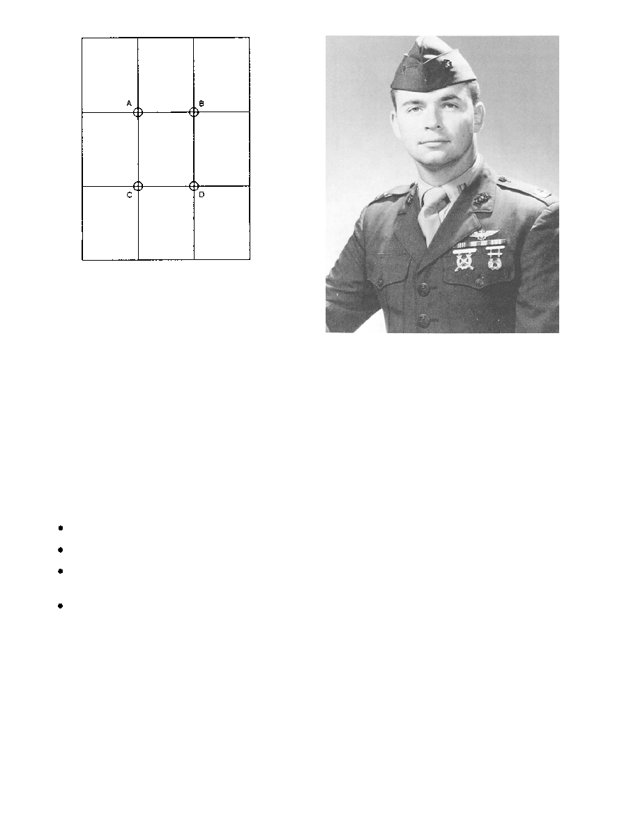
within a portrait that attract eye attention and are the
preferred locations for the center of interest (fig. 7-3).
In a portrait, when the main point of interest is located
Point D. If B is the point of interest, C becomes the
obviously balances the composition.
area in the picture space. Usually in portrait
composition, the eyes fall close to Points A or B. But
these positions are approximations only. The final
adjustment of the head depends upon several factors:
the eye direction, the shape of the body, and the leading
lines. No rule can be given for best portrait composition.
Rules only give guidance to a rough approximation of
good placement. You can only arrive at the best
composition for each portrait through the feeling for
balance and subject position.
Such placement is particularly appropriate when the
subject is a person of importance, such as the CO.
However, when the head is too high (fig. 7-4), viewing
the picture is uncomfortable because there is a feeling
that if the subject stood up he would bump his head.
Also, when the head is too high, the proportion between
head and body areas becomes awkward.
Basic Photography Course

As an Amazon Associate I earn from qualifying purchases.
WWW.DOFMASTER.COM
© 2006 Don Fleming. All rights reserved.
© 2006 Don Fleming. All rights reserved.